5 Colour Tools in Luminar that go beyond Lightroom
One of the things I love most about editing is experimenting with colour. Sometimes it's only a subtle tweak to the warmth of a sunrise or the richness of autumn tones, while other times a more creative approach can completely transform the mood of an image. Most photo editing software programmes will give you the basics when it comes to colour, but once you start looking for more creative control, that's where the differences really begin to show.
In this post, I'll explore Five Colour tools in Luminar that either aren't available in Lightroom or offer a faster and more intuitive way to achieve the same creative result.
First let’s take a look at the Colour Tools that are available in both applications.
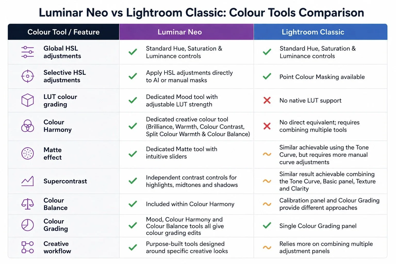
And now lets do a deeper dive into the specific tools!
1. Mood: add professional LUT colour grading into your workflow
One of the biggest creative advantages Luminar has over Lightroom is the Mood tool. Rather than relying on presets, Mood lets you apply LUTs (Look-Up Tables), which are widely used throughout the film and video industry for professional colour grading.
One of the biggest advantages is that Luminar also allows LUTs to be combined with masks.... By comparison, Lightroom simply doesn't offer any LUT support at all, masks or otherwise.
Some of you might be asking “aren’t LUTS the same as using presets?” And the answer is no, they are actually quite different!
A LUT (Look-Up Table) is a mathematical map that says: "If a pixel is this colour, then change it to this other colour."
For example, a LUT might add a gentle golden warmth to sunrise light, enrich the tones of autumn foliage or introduce cooler blue tones to a misty mountain scene, helping to reinforce the mood you experienced when you captured the image. Think of it as applying a colour "translation" across the image to remap a colour.
A Preset on the other hand is a saved collection of various editing settings, which might simultaneously adjust Exposure, Contrast, Colour HSL, Sharpening, and Vignetting.
So if a LUT is like the seasoning for a meal, the Preset is actually changing the whole recipe.
Here is the same image with 4 different LUTs applied:
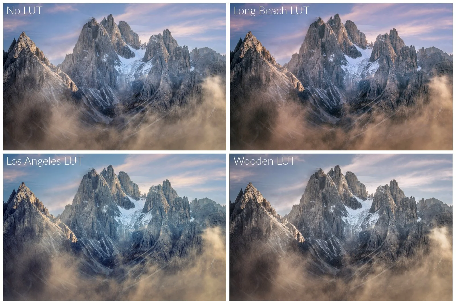
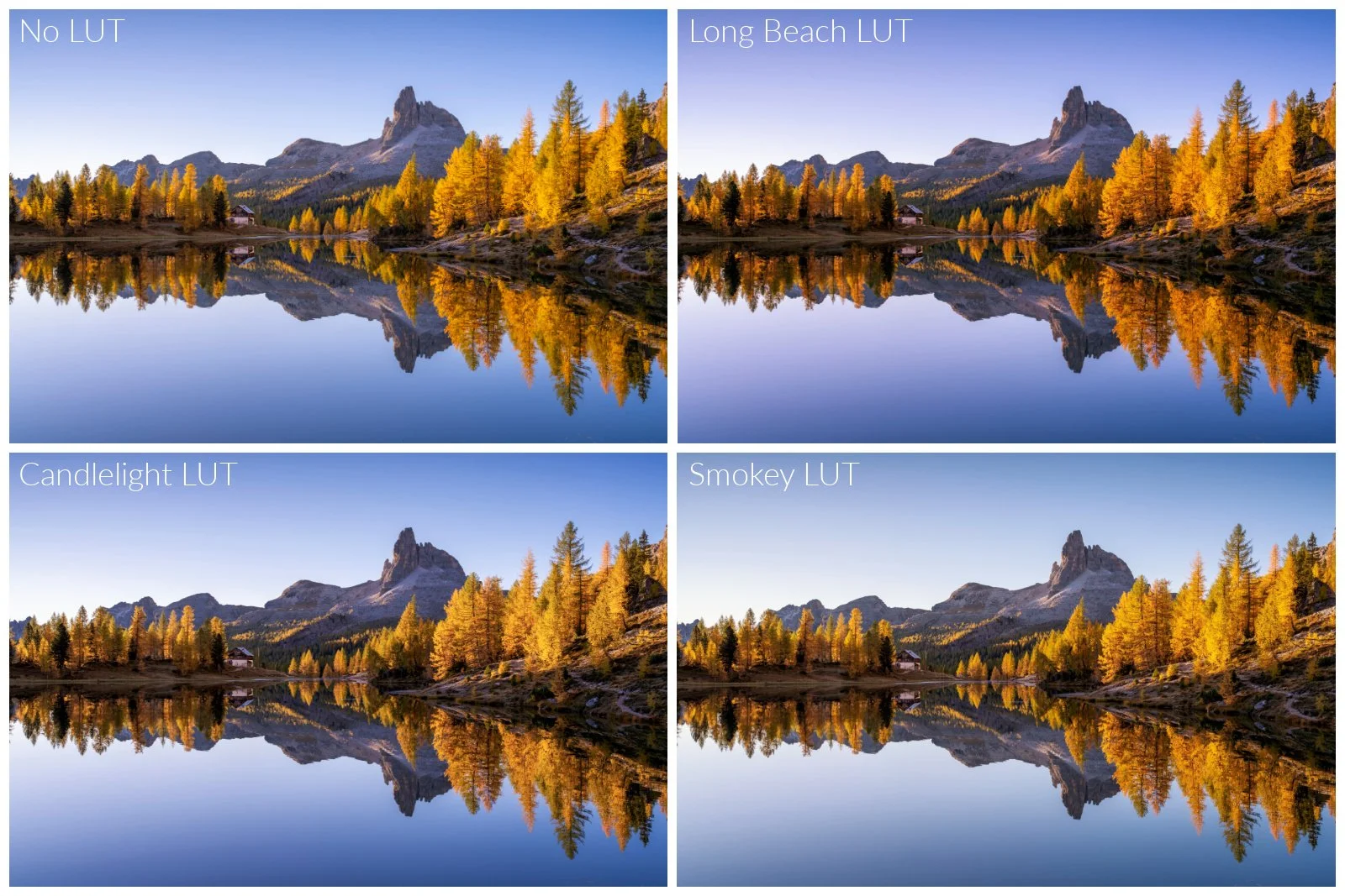
While these aren’t always the LUTS I head to first, they show the different way the LUTS can approach colour grading the same image. My favourite ones to use with Landscapes in Luminar are Long Beach, Beijing, Candlelight, and Ushuaia, as I think they naturally complement existing colour tones.
2. HSL + Masks: precise colour control where you need it
Both Lightroom and Luminar include Hue, Saturation and Luminance controls. But…the difference lies in the workflow. Luminar makes selective HSL adjustments feel much more integrated into the editing workflow.
Whether using AI-object selected masks, gradients, radial masks or brushes, you can target colour adjustments easily where they're needed. That means you can easily do adjustments like in the following example by enhancing autumn foliage and sky tones in clouds without affecting the rest of the image.
In Lightroom, HSL adjustments are only global. To apply them selectively, you need to create separate masks and make colour adjustments within that masking workflow using either the Color dropdown tools or Point Colour or both, it quickly becomes a much more involved workflow, particularly when you need to exclude or refine different parts of the image. It took me quite some time to try and replicate what I’d done in Luminar this way.
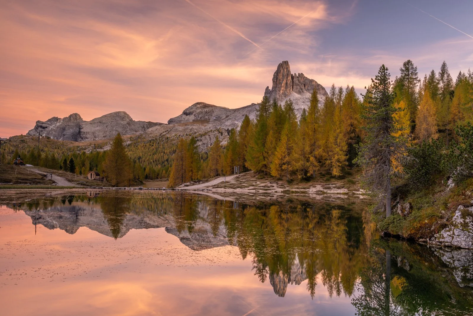
Original image before applying selective HSL colour to enhance the autumn foliage and sky
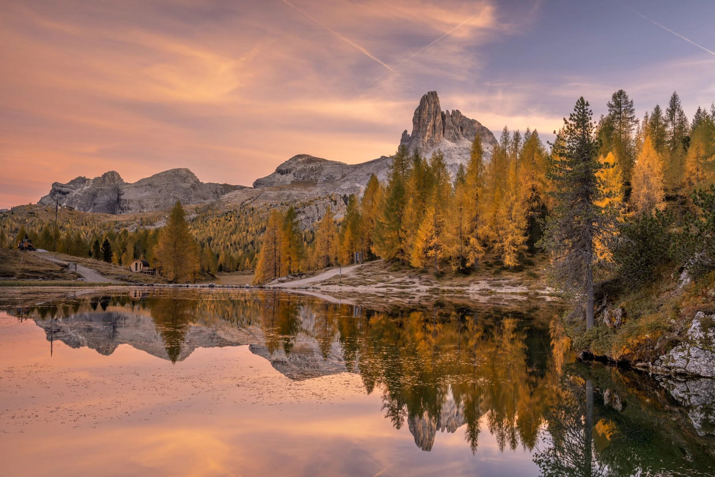
Luminar with HSL and Masks - a simple, quicker workflow completed in a couple of minutes
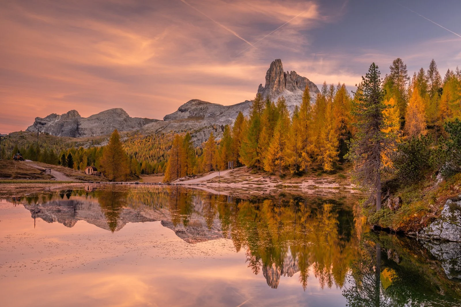
Lightroom HSL with Point Colour in Masks - this was a longer, more complicated workflow that took me about 4 times as long
3. Colour Harmony: A hidden gem
Colour Harmony contains some of the least understood tools in Luminar, mostly because there aren’t direct Lightroom equivalents. Rather than being just another saturation or vibrance adjustment, it focuses on the relationship between colours and tones, allowing you to create richer, more balanced images.
Let’s look at each of the tools within Colour Harmony:
Brilliance enhances colour richness and perceived depth without simply increasing saturation., while Warmth warms the whole image. I usually recommend ending with these tools using a gentle touch rather than starting with them while using Colour Harmony.
Colour Contrast - increases the brightness separation between complementary colours, helping them stand out from one another without simply increasing saturation.
Split Colour Warmth - rather than warming or cooling the entire image, it allows you to subtly shift different tonal regions within warm and cool tones. For example, you can preserve the cool blues in a shadowed valley while enhancing the warm glow of sunrise on nearby mountain peaks. This is similar to using Lightroom’s Colour Grading but focuses on just a yellow-warm/blue-cool split.
Colour Balance deserves a special mention. While Lightroom offers an RGB Calibration panel, Luminar approaches colour calibration differently by allowing you to fine-tune the balance between red, green and blue colour channels within the overall harmony of the image.
Here’s an example using each of these tools with an autumnal morning scene:
4. Matte: add a softer, timeless finish to your images
A subtle matte finish can completely change the mood of an image. I find that sometimes the darkest parts of an image which might contain pure black can look too punchy and contrasty, but Matte gives you a quick and easy way to change this. In Lightroom, creating a similar look generally requires manually shaping the Tone Curve and understanding how those adjustments affect different tonal regions, whereas Luminar includes a dedicated Matte tool with intuitive slider controls that make the process far quicker and easier.
Rather than adjusting points on a curve, you simply fine-tune the amount of fade, softness and tonal contrast until you achieve the look you're after.
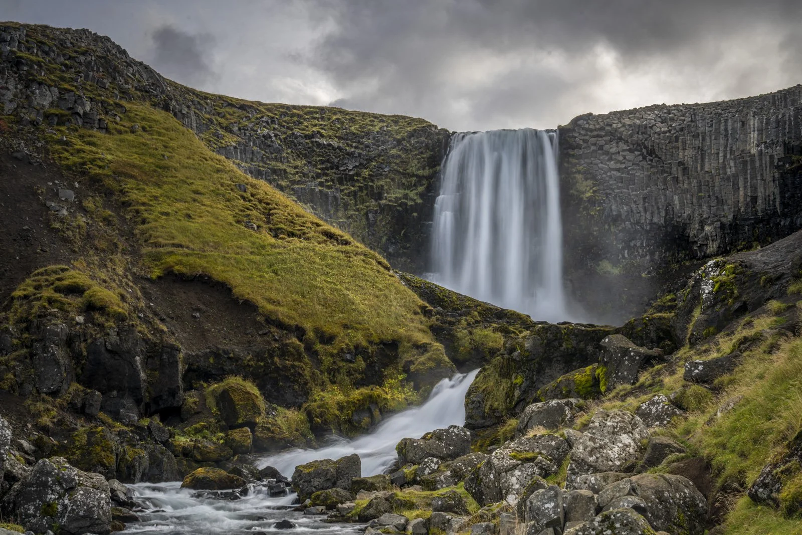
Original image
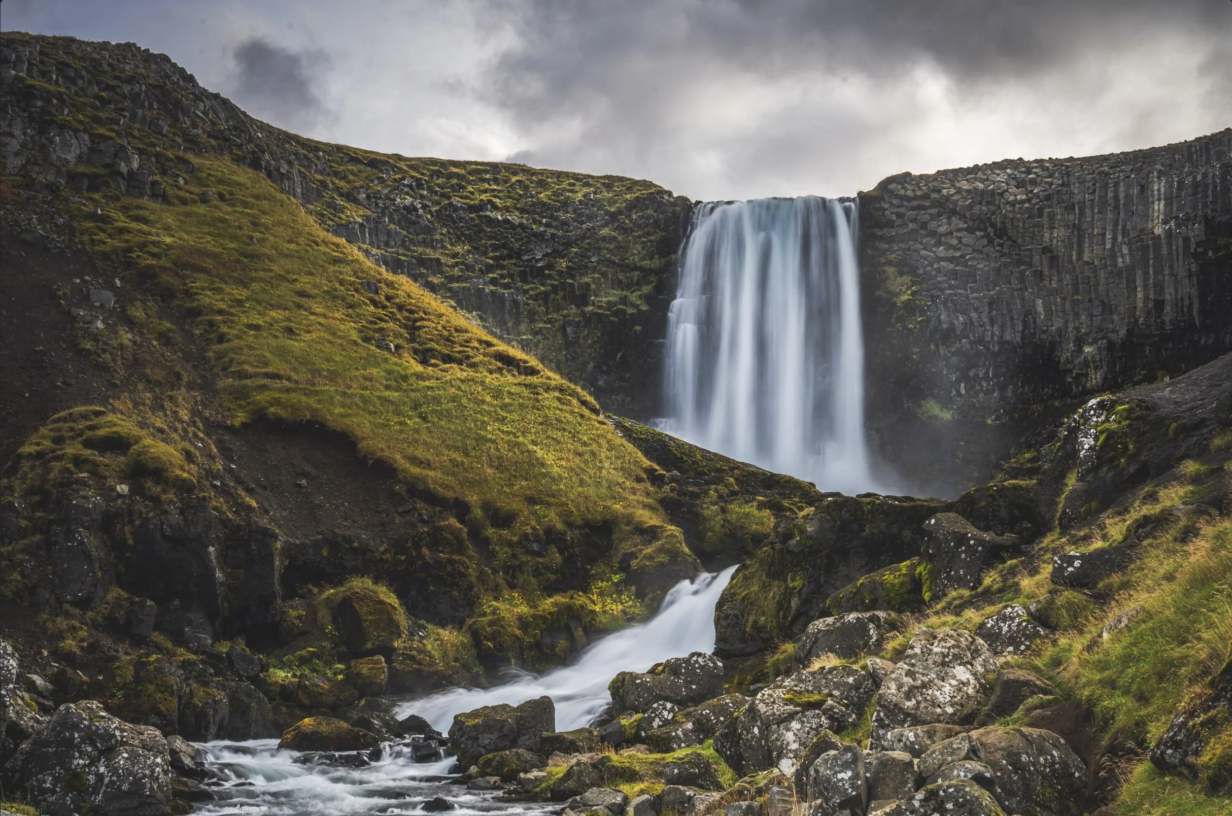
The same image with a Matte effect applied
5. Supercontrast: the easier way
Contrast is one of the most powerful ways to add depth and impact to an image, but not all contrast adjustments are created equal.
Lightroom includes multiple contrast controls like the Contrast slider and the Tone Curve , whereas Luminar's Supercontrast takes a different approach by bringing tonal contrast into one purpose-built tool with sliders.
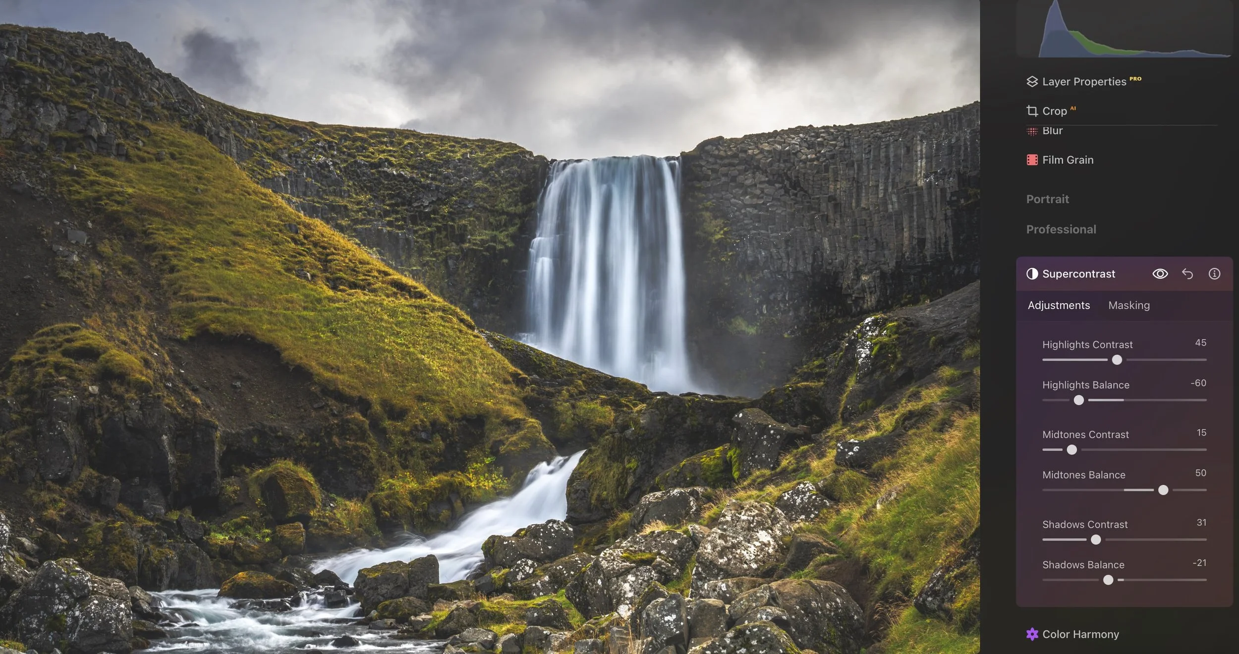
Instead of having to manually reshape the Tone Curve, Supercontrast lets you independently control the contrast in the highlights, midtones and shadows. Each tonal range also includes a Balance slider, allowing you to refine exactly which tones are affected. And of course, you can use this with Masks to target only certain areas.
This makes it incredibly easy to do things like:
Add drama to bright clouds without darkening the foreground.
Or conversely, increase highlights in a waterfall while leaving the sky untouched (like in this example)
Deepen shadow detail without making highlights appear harsh.
Add punch to an image while maintaining a natural look.
In this image, I added contrast to the foreground, especially in the water, leaving the sky as it was, you can see the sliders used on the right. I also added more contrast into the green/yellow areas of the ground to make them pop.
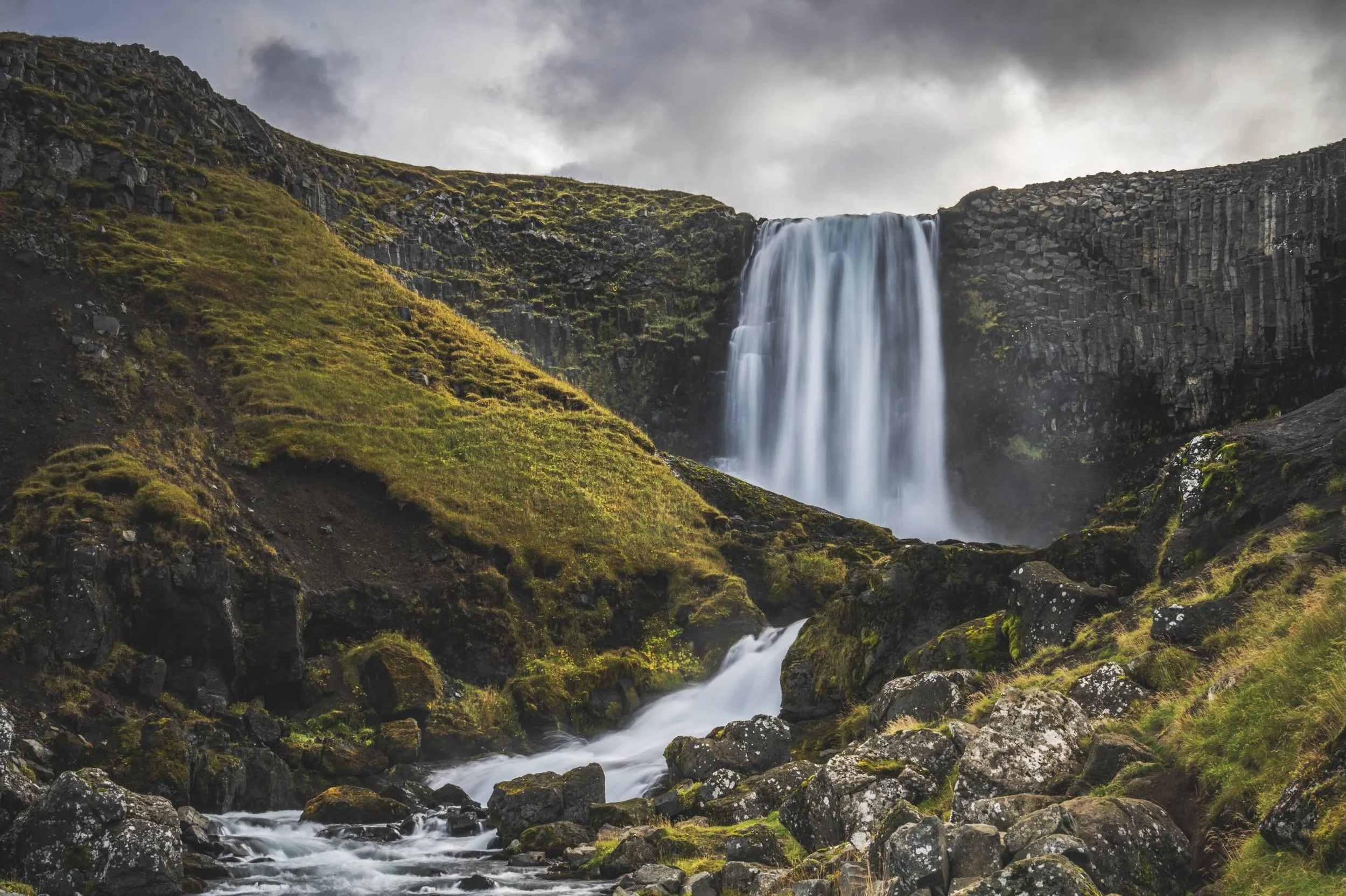
Before Supercontrast applied
But Wait…. Let it Simmer!
When editing (and especially so when using colour adjustments), it is really important to take a break from your screen and go make a cup of tea, before returning to take a fresh look at your changes. It’s amazing how much more of a critical eye you can assess your edits with once you have given your eyes a break from all the iterative changes you might have made.
Then, if you have time, leave the image again for a few days and come back to it - do you still like what you’ve done… if not, make more changes. This stops you from taking edits too far without realising how much you’ve done!
Final Thoughts
While I don't use every one of these colour tools on every image, I almost always spend a little time exploring the LUTs in the Mood tool. It's a quick and enjoyable way to experiment with different colour palettes and moods, often achieving a polished colour grade in just a few clicks rather than spending time fine-tuning multiple sliders.
And now if we put it all together… here is one example of an edit that is possible in Luminar using both Light Depth and a variety of colour tools giving me a result that I just wasn’t able to replicate with Lightroom’s tools.
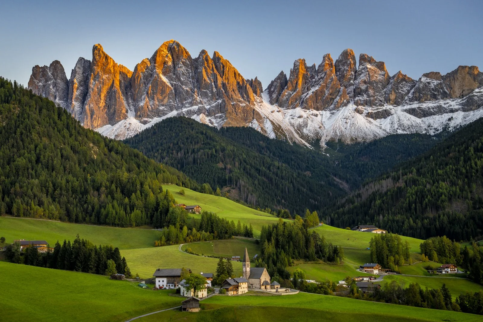
Lightroom edit
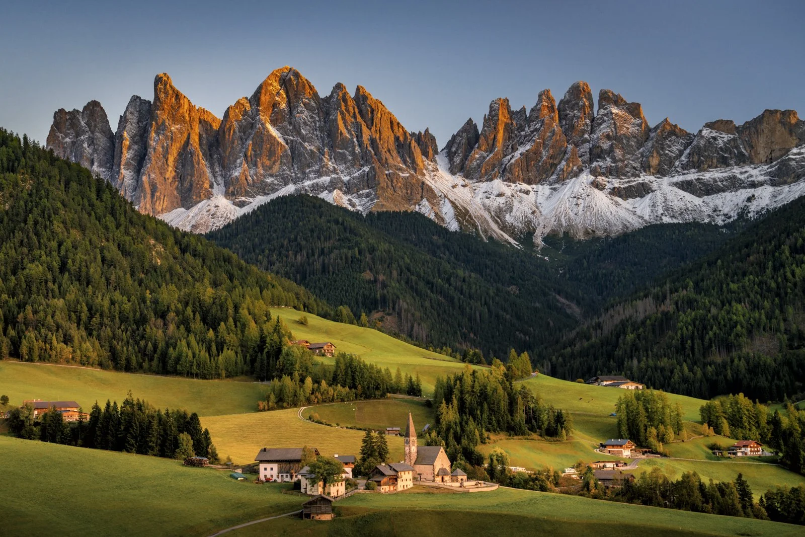
The final image - using Lightroom edit as a base and finishing in Luminar to produce a more golden, sunset feel where the foreground colours feel more cohesive and natural compared to the light on the mountains.
I think what I like most about Luminar Neo's colour tools isn't simply that they offer additional creative possibilities, it's that they make those possibilities far more accessible. In Lightroom, many of the effects can only be achieved by combining multiple tools as well as a solid understanding of how they interact, whereas Luminar packages Colour Tools into more intuitive options, allowing you to spend less time working out how to create a look and more time deciding what you want your image to say.
Keen to try Luminar yourself?
If you decide Luminar is a good fit for your workflow, you can purchase it here:
Luminarusing code MEGHAN10 for 10% off pricing
This helps support my content at no extra cost to you, and I only recommend software I genuinely use and trust!
Want to read more in this series?
Why I added Luminar Neo to My Lightroom Workflow (And You Should Too!)
Using Luminar Neo for Light, Colour & Mood (Why These Tools Make Images Pop)
Sky Replacement Showdown: Photoshop vs Luminar Neo
HDR Merge Showdown: Lightroom vs Luminar Neo
Panorama Showdown: Lightroom vs Luminar Neo
Focus Stacking Showdown: Photoshop vs Luminar Neo
Removal Tools Showdown: Photoshop vs Luminar Neo
Light Depth: The Most Underrated Tool for Landscapes?!